Taxing emails about tax day

When you are starting to think about taxes, and maybe beginning to daydream about how you might spend your tax refund, which of the following comes to mind first?

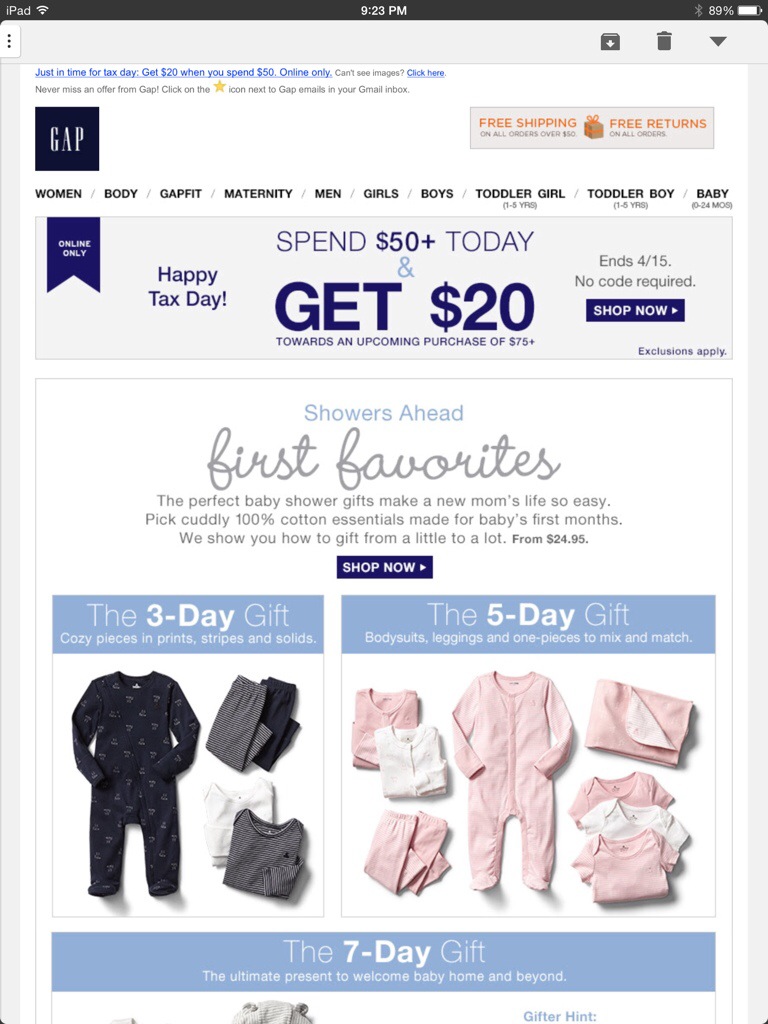
  1. A baby shower gift of clothing from the baby Gap (in increments of 3, 5 and 7 days)
  2. Clothing from Banana Republic for a price TBD after you determine to purchase it
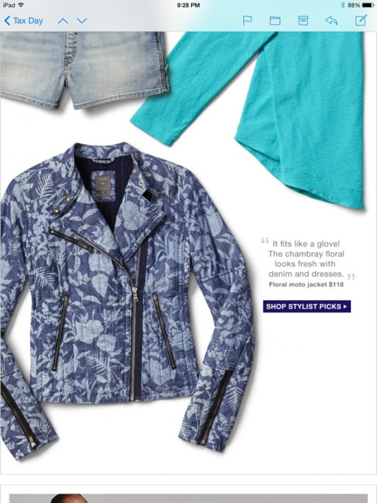
  3. Shorts overalls from the Gap with a black and white horizontal striped shirt and a floral denim moto jacket
  4. Adding more items to your cart at Bonobos to unlock bigger tax loopholes
  5. NY Minute Dating from LivingSocial

Any of those? No? That’s okay. These brands all sent emails suggesting these things to save you the trouble of having to think about how to spend your tax refund. (Assuming you’re getting one, and you’re getting it on April 15. I don’t know about you all, but if I’m expecting a refund, I send everything to my tax guy as soon as I get my W2s, and it is long spent by Valentine’s day.)

So, let’s take a look at the Gap and Baby Gap emails. They both used the same template and similar messaging (which is fine – brand consistency! Yay!).

The Baby Gap email didn’t offer an immediate discount, but instead a $20 coupon to use later on a purchase of $75 or more if you make a purchase of $50 or more today. Wasn’t that confusing? Maybe they’re trying to recreate the feeling of doing your taxes, or they’re assuming that since you’ve just completed your taxes, you’re a pro at understanding weird wording.

The featured products were different groupings of baby shower gifts for different days – the 3-day gift, the 5-day gift, and the 7-day gift. I didn’t really get it (but I also know very little about babies and the gifts people give to them.) Is that a thing? Should I be getting expecting mothers gifts that increase in size every other day?

20140415-221721.jpg

20140415-221752.jpg


The regular Gap email had the same confusing offer, and a more eclectic collection of products. And it went on for 5 screenshots on my iPad mini*.

gaptax1.jpg

gaptax2.jpg

gaptax3.jpg

gaptax4.jpg

20140415-221827.jpg

Next up is Banana Republic. Their tax day offering was something I had been planning on writing about in a completely different post: The Mystery Sale. Much like doing your taxes, this leaves the amount of money you will end up with in your wallet a total mystery when all is said and done. This email tells you that you have to click on the email to discover what your discount is. I’m sure that’s how most people like to shop, and it probably has zero effect on abandoned carts. (I just clicked it, at 10:45 PM, and got 40%. My guess is that the discount was 30% right when they sent the email, and that it slowly increased as it got closer to when the sale is over.) But then there was a section offering 40% off all in-store purchases right now. I guess they were trying to encourage people to shop in the store instead of online (on a Tuesday? Good luck.).

bananatax1.jpg

bananatax2.jpg

bananatax3.jpg

Bonobos took a humorous approach to their messaging with this weird email about the “Bonobos offshore tax haven” where you can “Unlock bigger tax loopholes by adding items to your cart.” Seems legit.

But then they sent it twice in one day with different subject lines.  Five hours apart. I guess that’s one way to test send times.

bonobos_tax.jpg


Lastly, I had this one from Living Social. If your taxes made you acutely aware of your marital status (or lack thereof), never fear! Living Social will give you $5 off a speed dating event in NYC! (Or any other deal they offer, but that was the first one in my email and was mentioned in the subject line.)


livingsocialtax.jpg


Happy Tax Day, everyone. If you got a refund, go enjoy it!


*Can someone recommend a better way to get screenshots of emails/or a free or cheap app to splice them together? My computer is on its deathbed (and very slow), and I don’t have Photoshop or any software to splice these screenshots together into one image for each email. The screenshots on my iPad were easier to take, but I want to crop out the non-email parts of the screenshots and make them look prettier. HALP.

Subject line Sunday: Mad Men edition

I’m excited that Mad Men is back tonight, even if it means I’ll be up pretty late since it’s on at the same time as Game of Thrones (and I can’t just save one for tomorrow. I’ve waited too long for both of these shows.) I think a lot of marketers and advertisers love the show because it makes our jobs seem really cool (and we understand why the stress of their jobs leads them to drink all day long).

Lots of brands have tried to use everyone’s love of excellent television to their own advantage (not unlike I’m doing right now by posting this hours before the show is on…). But this subject line on today’s email from Jack Threads that my co-worker forwarded to me is pretty bold.

Subject: Don’t Dress Like a Dick (…Whitman). Suit Up Like a Boss in Mad Men-Inspired Style.

Kind of risky, right? Not everyone watches Mad Men, and I’m sure they had subscribers who had no idea what that first sentence meant. I’m sure some people were offended and unsubscribed over it.

But did they open the email? Probably.

jack threads mad men 1a

jack theads madmen2

jack threads madmen3

I would add the rest of the email, but it went on forever like this and I need to mentally prepare for the amazing television I’m about to watch. But you get the idea. Enjoy Mad Men tonight!

Thumbs up Thursday: Welcome Emails

Welcome emails can be tricky. It’s not always easy to make the right first impression, and sometimes the welcome email isn’t even managed by the email marketing team because it’s sent through a CRM or other system.

But they’re still so, so important. Here are three welcome emails that I really liked out of the batch I recently received:

1. Kate Spade Saturday

This email introduced the brand in an adorable way. It’s bright and cheery, and it uses its fun yellow brand color as a way to highlight key information (literally!). It showcases some product mixed in with thoughts of everyone’s favorite day of the week, and closes with a 15% discount and messaging about free shipping, free returns, and new arrivals every week.

saturday1 saturday2

2. Gap

Good ol’ Gap. They probably invested a lot of time and effort into one of the most detailed preference centers I’ve ever seen, so it makes sense that they would encourage subscribers to, you know, use it. They send so many kinds of emails that I’m sure it can get pretty intense if you’re signed up for all of them. (I guess I’ll find out since I subscribed to everything). But if you don’t fill in the preference center, who knows what kind of emails you’ll get? (Seriously, who knows? I can’t not fill out a preference center if there is one.)


3. Family Dollar

This one surprised me a little. This isn’t a store I typically shop at (sidenote: I’ve purchased things from both Saturday and Gap in the last week). It may be lacking in design a little bit, but I thought it was actually pretty good in terms of messaging – it outlined the types of emails their subscribers might receive, showed some of the brands that they carry in their stores, and encouraged use of their mobile and social channels. There’s a cluster of buttons at the bottom that are what made me like this email: they list categories for their products and encourage subscribers to click on them to see the latest products.

Family Dollar Welcome email

While these buttons may not look the prettiest, they serve a purpose. They’re acting as a makeshift preference center (I hope.  I really, really, hope). I clicked on the “Pets” category because I have a dog. Now, Family Dollar knows that I likely have a pet (or would at least possibly be interested in shopping for pet items), and they can just run a filter or query of people who clicked on the “Pets” link and start  sending them content about their pet products. Same goes for any of the other categories.

Family Dollar doesn’t have the robust preference center (or design budget) that the Gap has. Their preference center is a very basic, out of the box one that is pretty standard for a certain ESP that we all know and love. I’ve used that preference center. It’s a bit limited in terms of customization. But finding a workaround as simple as putting a link in the email was a great way to make use of what they had. That’s one of the many things I love about email marketing – it can be great for any brand, at any level if you know what you’re doing.


Maybe someone should REFINE their welcome email a little bit…

Here’s one welcome email that came very close to being a great email, but then had a huge flaw.

Refinery29’s emails promise “A daily dose of style, beauty, fashion, and more from Refinery29’s expert editors”. Now, this welcome email would have been perfectly fine, except for one small (::cough:: HUGE) detail at the beginning of the email that shows that their email team may not be the most current on what’s going on with the email marketing industry.

Image

The ENTIRE viewport is a message about moving their emails into the Primary tab. (For scale, this email browser is maximized on a 13 inch Mac screen.) Oh, Refinery29. That is SO summer 2013. We’re not doing that anymore (“We” meaning “pretty much every brand”). We decided that it was silly to send that kind of messaging, and it’s not so bad to be in the promotions tab if your emails are good. Didn’t you get the memo on that? And the first sentence concerns me a lot – Are you reading this on Gmail? Does that mean that there are Yahoo, Hotmail, etc subscribers who are getting that messaging that takes up half the screen? Nooooooo. Why would you alienate so many subscribers in your WELCOME email?

If they remove that block – the rest of that email is actually quite nice. It describes the frequency (daily), the emails they send, (without using the awful “first to know” phrasing so many brands use), and gives content from their social media channels (along with links encouraging subscribers to follow them). SO close to being a really solid welcome email. It’s clean, designed well, and easy on the eyes.

Image

The one other thing I would have liked to see in this email is a callout for the preference center for subscribers to select their location, since that wasn’t in the initial signup. Their emails are based on location (but they have an “Everyone” version that is the default. 

I’ve been getting their emails for about a week now, and there’s definitely more I’m going to write about their subject lines. Another time. 

First impressions are important, people.

Unwelcome emails

One of the joys of signing up for so many emails all at once is that I got to see a lot of different welcome emails and compare them. For most brands that I subscribe to in my “real” email account, I’ve been a subscriber for a very long time, since before I really cared about welcome emails. This gave me a chance to see these brands from a new perspective. There were also quite a few I subscribed to that I normally wouldn’t, so I was hoping for welcome emails that would tell me more about the brand.

In general, there are a few elements that I would expect a good welcome email to have: double opt-in, encouraging the subscriber to update preferences, a short overview/description of the brand and types of emails the subscriber will receive, and perhaps a discount if it was promised at sign-up. Pretty standard, right? RIGHT?

I went through all 64 welcome emails in my inbox with a checklist to see what elements they had.

Ladies and gentlemen – from this experiment, I fear for our industry. Based on my sample, it seems that 25% of brands have email subscriber lists so small that I was their very first subscriber.

That’s right. I hate to brag, but I just thought you should all know that I’m going to be THE FIRST TO KNOW about the latest discounts, products, and other cool happenings at all these brands. Not you, not their other millions of subscribers. ME.  I’m going to be the FIRST! They said so.

Screen shot 2014-04-07 at 10.06.47 PM

Screen shot 2014-04-07 at 10.07.54 PM

Screen shot 2014-04-07 at 10.09.31 PM

Screen shot 2014-04-07 at 10.10.07 PM

Screen shot 2014-04-07 at 10.10.22 PM

Screen shot 2014-04-07 at 10.11.26 PM Screen shot 2014-04-07 at 10.11.41 PM

You get the idea.

I know that there are only so many ways to get people excited about receiving your crappy marketing emails, but let’s not lie to our subscribers, okay? I know for the brand I send emails for, we usually send later in the day since they perform better for us, so email’s definitely not the place where people will be the “first to know” about anything. (Just first to convert. #emailrules)

Of course, some of the lists are very exclusive. Luckily, I’m an insider and I’m on the list (at least for the 12 brands that used that kind of language in their welcome emails). Brands – I hate to break it to you, but your email list isn’t exclusive. And if it’s so hard to sign up for your emails that you’re congratulating subscribers on being on your list, there are some bigger problems here and you should re-evaluate your sign-up process.

Like I said earlier, as part of this project, I subscribed to emails that I normally wouldn’t. When I filled out preference centers, I selected every option available. For Piperlime, that meant Men and Women. Here’s what their welcome emails looked like:

piperlime men         piperlime women


Now, on their own, neither is THAT bad. (Minus the condescending “You made the list!” in the women’s version). I thought the headline in the men’s version was hilarious (as was the subject line, “Get the hook up.”). But, the women’s version gave a nice checklist of the types of emails subscribers could expect to receive. Piperlime, you could combine the best elements of these and have an amazing email. They’re pretty.

At least they were pretty on-brand, and it was clear who they were from. Unlike this guy:

From name: Shop Your Way

From Email: rewards@rewards.shopyourwaryrewards.com  (Wait, so are there rewards?!?!)

Subject line: Welcome! Now unlock all your perks

searsshopyourway

There was no indication of who it was from until I opened the email and saw the Sears logo. I don’t know who “Shop your way” is. And I’ve gotten other emails from Sears since this one that had the same branding. I’m pretty sure Mr. Can Spam is rolling in his grave right now.

There are more emails to write about, but I’ll save them for another post. It’s really overwhelming to be the first to hear so much news, and I’m frankly exhausted from it.


Subject line Saturday: April Fool’s edition

Marketers just go nuts over April Fool’s. I get it – having a way to change up your content and possibly even gain social media attention is very welcome when you’re running out of things to say about spring and not ready to start promoting summer. But there’s a fine line between being funny or clever and trying too hard. “Official” April Fool’s jokes by brands have gotten so popular that they’re practically expected. Brands that aren’t doing an April Fool’s campaign tend to go the opposite route and don’t release actual products on these days for fear that they’ll get lost in the prank messaging (or worse, their product may be seen as a prank itself!).

Litmus did a nice roundup of this year’s April Fool’s emails. Here are a few others I received:

1. Murray’s Cheese (why yes, I do subscribe to emails about cheese. Don’t you?)

Murray’s is a gourmet cheese shop in NYC. In addition to selling delicious cheeses, they also offer classes on MAKING cheese.

I thought this email was great – it had a pun in the subject line (always a win for me!), and the joke was funny, relevant to their product, and very obviously a joke. I saw a lot of others this year that weren’t so obvious.

Subject Line: Murray’s Cheese: To the Milky Whey and Beyond!

Murrays040114


2. Old Navy

What I liked about this email was that it was so on-brand for Old Navy that it wasn’t immediately clear that it even was an April Fool’s email. I get a LOT of emails from Old Navy, and rarely shop there. Until I started this blog, I didn’t really pay much attention to most emails from Old Navy (or really, any brand that sends emails about clothes daily).

This email took a different approach than most brands do for April Fool’s – it took an existing, actual product and just marketed it in a fun and silly way: Action Star Jeans! The models were wearing fake mustaches, and the copy said things like “These jeans are so tough, they make onions cry.”  The price made it clear that this wasn’t a typical Old Navy email – $99.94 . The email featured a coupon and linked to their homepage, so it probably generated more revenue than social media buzz. (How many other April Fool’s emails can say that?).

I didn’t love the subject line – I’m not a fan of title case, and it had no indication that this might be a special/different email, so I feel like it really did a disservice to the creativity that was put into the rest of the email.

Subject line: Hi-Yah! Chop An Extra 10% Off Sale Items

oldnavy04012014

3. Poppin

This email was just fun. Poppin sells cheerful, brightly colored office supplies. Their April Fool’s email featured a “Mood Pen” that changes colors with your mood so your co-workers can “know how you’re feeling without having to ask!” The pen image on the right was a gif that changed to all of the different colors they offer, and the left side listed possible emotions that your pen could show, and they were funny – hungover, smart-alecky, hangry.  Their company slogan is “Work happy,” and their primary brand color is orange, so naturally the orange mood was “Working happy.” I loved that this one was fun and playful, but still managed to showcase their brand and actual products (even though it was through a fake product).

The subject line was pretty straightforward, and just intriguing enough to get people to open the email to see if this was a real thing.

Subject line: Meet our Mood Pen with new color-changing technology!

poppin04012014


I think the takeaways here are that good April Fool’s emails should be on-brand, funny, and relevant to your actual product offerings. Sure, it’s funny to create a fake product that tricks people, but wouldn’t you rather have your subscribers see you as clever and creative?

Email signups: The good, the bad, and the MIA

In starting this blog, I created an email address specifically for it. Then I found a list of the top 100 retail brands, and set out to subscribe to as many of their emails as I could. That in itself was an interesting experience.  I’m going to continue to subscribe to more emails all the time, but here was my initial deep dive. It was really eye-opening to go through the process for a bunch of emails all at once and compare the experiences across different brands. It was especially useful for the brands whose websites I don’t normally visit, since I had to figure out how to navigate everything as a completely new visitor.

The Good
Gap had an email signup pop up a few seconds after I went to the website. Which, for my purposes, was actually kind of helpful. I didn’t want to spend that much time digging around most of these sites anyway. But normally, most people would find that annoying, because I’d imagine very few people go to an eCommerce site with the intention of signing up for emails. They also had an email signup at the bottom of their home page. Immediately after entering my email address, it went straight to a VERY detailed preference center, which asked me to select what categories I was interested in (Men’s, Women’s, Children’s? Maternity? Plus size?- I picked them all!). Then, it had a checkbox for “Would you like to hear from our other brands?” which led to a wormhole of signing up for Old Navy, Piperlime, Athleta, and Banana Republic – and then individual preferences for each of these brands as well.

I totally love this. As a consumer, I can ensure that I’m getting very specific content (assuming that they’re actually segmenting emails based on these preferences). As a marketer, Gap can reach customers who come in through any of their brands, and they don’t have to guess the subscriber’s gender or family status to send them targeted content.

Similarly, Ikea had a great preference center immediately following email signup. The actual email signup (for the US site) was small and subtle in the top right-hand corner, but easy to find. The email signup offered mobile text alerts and physical catalogs in addition to emails, and then just asked for First Name, Last Name, and Zip (in order to target content about the nearest store). After filling that out, the preference center asked a few yes/no questions that seemed a bit personal at first – “Are you engaged to be married?” “Do you have children?” “Are you a renter or a homeowner?” etc. I clicked engaged and put in a fake upcoming wedding date. I’m expecting to see emails about wedding registries and home remodeling. Let’s see what happens!

The Bad

When I signed up for Bed Bath and Beyond emails, this guy popped up:

bbbsignup

Sooooo many required fields (including mailing address)! Bed Bath and Beyond – I am signing up for EMAILS. I am showing interest in your brand, and I am telling you how I would like your brand to communicate with me. And guess what? My way costs you less money. If you email me those weekly 20% off coupons (with a promo code I can use in store), you don’t have to spend money mailing them to me, and I’m more likely to have them available on my phone when I’m shopping at your store. NEXT.

So, Kohl’s. First, I had to scroll to the bottom of a very cluttered home page to even find the signup, and it wasn’t 100% that that’s what it even was: kohls email signup Once I typed in my email address (with a “+kohls” in the middle because I ❤ gmail filters), I was told that it was an invalid email address. Well played, Kohl’s. But you’re wrong. Let me enter my email the way I want. (Toys R Us did the same thing). NEXT.

Oh, Amazon. Don’t worry, we’re cool. Except that I had to create an account to sign up for emails. (I obviously have an actual account because I order from Amazon at least once a week, but I wanted to see how they market to people who haven’t shared a ton of purchase behavior info already. It appears that they don’t.) NEXT.

The MIA

This one kind of surprised me.  I thought that Target MUST be doing something cool with emails. Articles have been written about their impressive use of data to target marketing. And yet…

I couldn’t find a place on Target’s website to sign up for their emails.

Some stores labeled their email sign-up as “Weekly Ads,” but Target actually had a digital version of its weekly ad there. They had a page called “all the deals” (which made me think of Hyperbole and a Half), but it still didn’t have an email signup. Eventually, I found a section that said “New Guest?,” which led to an account creation page.

But once I created an account, there wasn’t a way to give any preferences (and weirdly, the only personal info they asked for was first and last name, and birth month). There was a link on the sidebar for “Manage Subscriptions” (and maybe this is where my disadvantage as an email marketer comes in), which I assumed was about email preferences, but it wasn’t. I’m still not really sure what it was, because there was no copy explaining it. NEXT.

targetsubscriptions

Best Buy had a similar setup. It required creating an account to sign up for anything. It took a lot more tries than normal to come up with a password, because they required a lot of different characters. (Normally, that’s fine for a password – for things that need to be secure. I just want to sign up for your emails). Then it required a phone number to “look up your account” in stores. And after begrudgingly filling that in, it looks like all I did was create an account with Best Buy (and there wasn’t a way to sign up for emails there, either). I browsed around on the site a little more, and found an email signup on their “Deal of the Day” page, but it took some digging to get there.

Huge missed opportunity, Best Buy. You sell tons of different types of products, and I guarantee I’m only interested in a small percentage of them. Please get a preference center ASAP.

What’s your email sign-up process like?

The welcome email

I get a lot of emails. To be fair, I also send a lot of them. Like, a LOT. Several million a month. Even though I’ve been doing this for a while, it will always be a little scary clicking send. Email marketing is a very public job. If there’s a mistake, millions of people can see it – instantly. Sure, depending on the mistake, most people probably won’t see it. Most brands should be so lucky to have people open and completely read their emails, let alone notice a mistake. (Unless it’s in the subject line, pre-header, or from name. Poor Google Wage.)

But I notice them. I scrutinize the emails I receive, and then I put a label on them – Good email marketing or Bad email marketing. The “Good email marketing” emails get forwarded to co-workers with a “Hey, we should be doing this.” The bad ones? Well, they get tweeted about with the hashtag “#emailsnarketing.”

Tweeting about them isn’t really all that helpful. While it’s fun to be snarky and cringe at typos in subject lines, it’s not really helping anyone. I want to help everyone make their email better.

So I’m going to write about them here. I just subscribed to a LOT of emails from all kinds of brands. Many of them are popular brands that I normally don’t even shop at or subscribe to, but now I do. I’m going to call out bad email practices and make suggestions for improving them. I’m also going to have “Thumbs up Thursday” for brands that are doing it right. Maybe someday, that will be every email.

welcomeinbox