Thumbs up Thursday: Behind the scenes collaborations

I love it when brands send emails with interesting content. In an inbox full of mystery sales, stupid gifs, and unnecessary holiday emails about non-holidays, it’s nice to see something that just wants to tell me an interesting story rather than sell me something. It makes me feel more connected to a brand. I’ve gotten a few emails recently that profiled how a product is made or the designer who made it, and I think they’re great.

This email from J. Crew shows how their Point Sur denim is made. I personally have never really been interested in buying jeans that were already destroyed, especially when they cost more than perfectly intact jeans, but I guess I’m a little old-fashioned (she says as she’s wrapped in an afghan that she crocheted, and drinking herbal tea. Whatever, it’s freezing.).

While I’m not particularly interested in distressed jeans, I love sewing and clothing construction, so I enjoyed seeing the process for how these jeans were made (just in case I ever decide I like the style and want to try it myself!). It also showed how these jeans are special and that each pair is unique, which probably helps justify their $238 price tag. When you click through to the site there’s a nice slideshow detailing how the jeans are made.

From: J. Crew
Subject line: Made in LA

jcrew_1_0430

jcrew_2.1_0430

jcrew_3_0430

Nice, right?


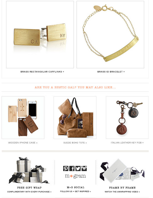
Another email that recently gave a little more than a sales pitch was from Mark & Graham, which sells a lot of monogrammed products (jewelry, bags, etc). This email featured jewelry designer Shelly Harper and some of her work. It gives their products a nice level of personalization (see what I did there? They sell MONOGRAMMED stuff!), and the jewelry they featured is delicate and nice.

From: Mark & Graham
Subject Line:  Meet the designer, Shelly Harper

harper_0430_1

harper_0430_2 harper_0430_3


Thumbs up Thursday: Welcome Emails

Welcome emails can be tricky. It’s not always easy to make the right first impression, and sometimes the welcome email isn’t even managed by the email marketing team because it’s sent through a CRM or other system.

But they’re still so, so important. Here are three welcome emails that I really liked out of the batch I recently received:

1. Kate Spade Saturday

This email introduced the brand in an adorable way. It’s bright and cheery, and it uses its fun yellow brand color as a way to highlight key information (literally!). It showcases some product mixed in with thoughts of everyone’s favorite day of the week, and closes with a 15% discount and messaging about free shipping, free returns, and new arrivals every week.

saturday1 saturday2

2. Gap

Good ol’ Gap. They probably invested a lot of time and effort into one of the most detailed preference centers I’ve ever seen, so it makes sense that they would encourage subscribers to, you know, use it. They send so many kinds of emails that I’m sure it can get pretty intense if you’re signed up for all of them. (I guess I’ll find out since I subscribed to everything). But if you don’t fill in the preference center, who knows what kind of emails you’ll get? (Seriously, who knows? I can’t not fill out a preference center if there is one.)


3. Family Dollar

This one surprised me a little. This isn’t a store I typically shop at (sidenote: I’ve purchased things from both Saturday and Gap in the last week). It may be lacking in design a little bit, but I thought it was actually pretty good in terms of messaging – it outlined the types of emails their subscribers might receive, showed some of the brands that they carry in their stores, and encouraged use of their mobile and social channels. There’s a cluster of buttons at the bottom that are what made me like this email: they list categories for their products and encourage subscribers to click on them to see the latest products.

Family Dollar Welcome email

While these buttons may not look the prettiest, they serve a purpose. They’re acting as a makeshift preference center (I hope.  I really, really, hope). I clicked on the “Pets” category because I have a dog. Now, Family Dollar knows that I likely have a pet (or would at least possibly be interested in shopping for pet items), and they can just run a filter or query of people who clicked on the “Pets” link and start  sending them content about their pet products. Same goes for any of the other categories.

Family Dollar doesn’t have the robust preference center (or design budget) that the Gap has. Their preference center is a very basic, out of the box one that is pretty standard for a certain ESP that we all know and love. I’ve used that preference center. It’s a bit limited in terms of customization. But finding a workaround as simple as putting a link in the email was a great way to make use of what they had. That’s one of the many things I love about email marketing – it can be great for any brand, at any level if you know what you’re doing.